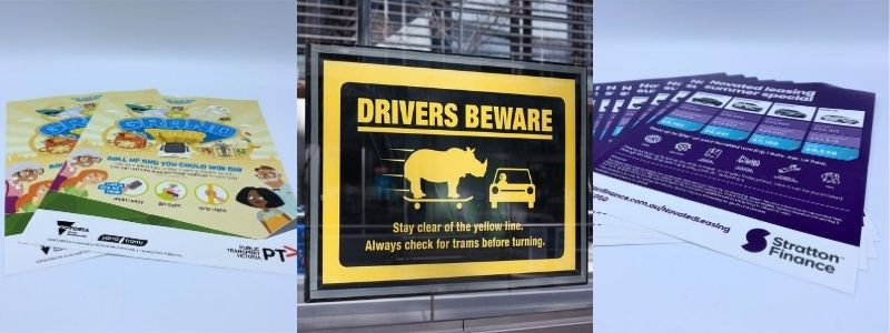
Designing Posters for Advertising
Whether digitally shared or printed, how to design posters best continues to be a very popular media question. They are often used and ideal for advertising books, events, restaurants, and so much more. They can be placed at bus stops, public noticeboards and walls. In fact, you stick them up anywhere you can think of, unlike other mediums.
But not all posters work with the same impact. Some are designed and created so beautifully that everyone will be attracted to them. On the other hand, some do not catch any attention due to their dull design. They fail to serve the purpose they were created for and that is really important to understand.
Follow these simple and easy tips if you want to know how you can create attention-grabbing and engaging posters.

Tips for How to Design your Posters:
Keeping Your Audience in Mind
When creating your posters, you may have an idea of what you want it to achieve. The first rule always is to consider your audience. You may love your design, but it may not be attractive to them. You need to know the interests of your audience and what they would like to see. Then, provide them what they want by designing a poster that makes sense.
Don’t forget to put yourself in their place. Imagine if they would like a poster full of information or an image-heavy poster. For example, event posters are designed differently than movie posters. You just always have to take into consideration your audience’s liking when making decisions.
Choosing the Right Colours for your Posters design
Colours alone can create a big difference in your eventual impact. They set the tone and can make your audience respond to your call to action.
For a successful event, you may want to include the colour red. This colour is known to get people excited. For a company event, you need to work with the colours of your brand to show consistency. But, you can deviate once in a while to stir things up a bit. If it’s for a kid’s event, you need to select colours that are bright and vibrant.
Always see to it that you choose colours that complement each other. You need something with the right contrast so that it will not be too difficult to read the text.
Text Placement and Font for your Posters
You need to pay special attention to typographical errors. Everything matters from the size of the texts, fonts, and placements.
If you want a modern look, you need to go for a clean and cool looking font to get your message out there. For an upbeat and fun advertisement, you can try other fonts and see if it gives you the effect you are looking for.
The layout of your text is also an important element. It goes without saying that you need to make sure that your readers will be able to see your call-to-action and other vital information.
In Conclusion
As you work through how to design your poster, you have to remember that your message is the focal point. It should not hide among the texts or images. A great poster will get people to make the right move. You need to be creative and realistic when creating the design to attract your target audience.
If you are designing posters for advertising an event, you will surely be looking for some promotional t-shirts or maybe even hoodies. How about hi vis vests with your brand on them? Browse our Promotional Clothing website Fast Clothing and ask us for a quote!

